I haven’t self-published anything in a long time, and prepping Wisdom of Walt Disney for paperback and re-publication has required me to learn or relearn a lot of things. Though the experience still hasn’t been nearly the nightmare it was the first time I tried it.
To make it easier on any of my fellow writers reading this, here are a few quick tips that I wish I had known ahead of time:
1. Kindle Previewer (or a similar program) is your friend. You do not want to have to check your work by uploading the file and hitting the ‘previewer’ on the KDP bookshelf over and over again (and some of you are probably laughing at me for even trying to do it that way). Download their free Kindle previewer and check your work there first.
Though that said, the on-site previewer is helpful, as it tells you exactly where the problems are if there are any. It just can take forever to load (I’ve seen it take several minutes sometimes). And keep in mind that, if the margins are too tight, italicized text can poke over the border, resulting in the frustrating situation of a single spot on a single page holding up the whole book.

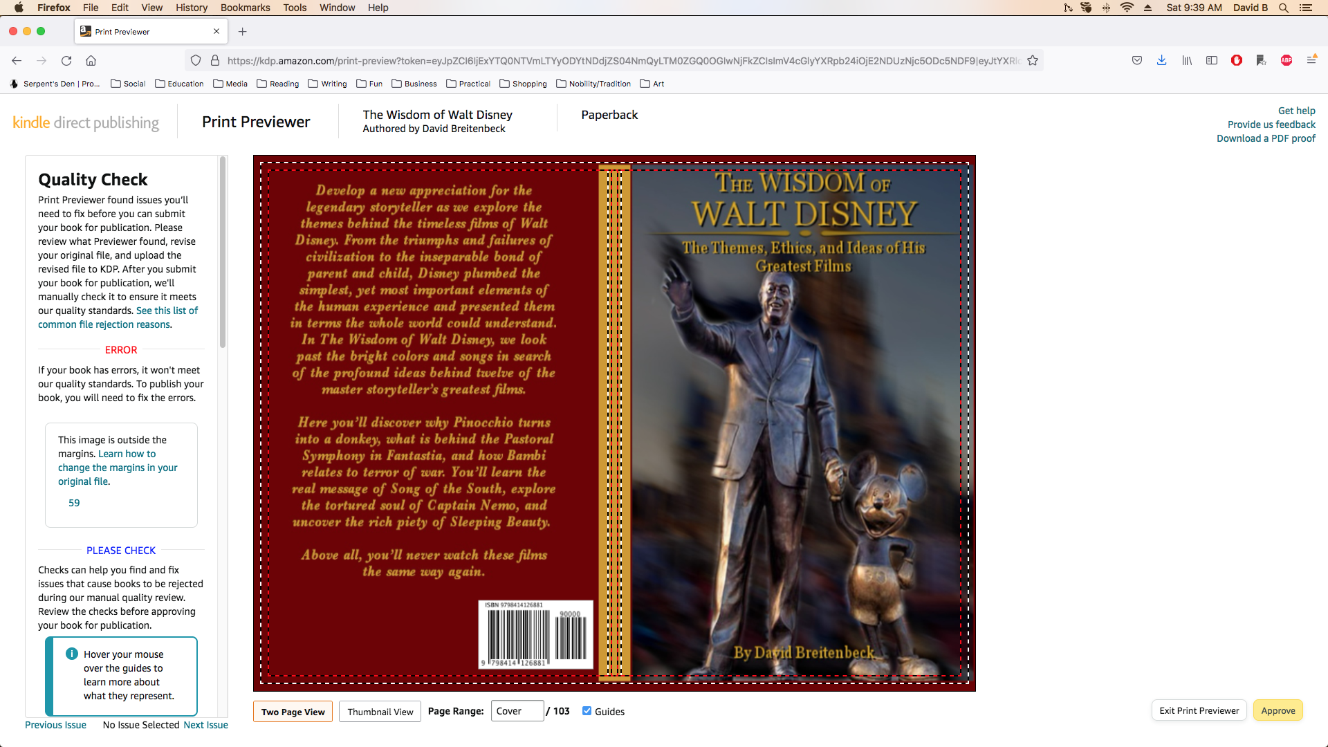
2. Oh, related to that screenshot, images in the text don’t obey the margins on some settings, so you’ll have to adjust those manually. And it makes a difference whether they’re on the right or left hand pages, meaning that a picture that was fine last go ’round can raise a red flag this time. So, if you have illustrations, expect to be adjusting them a fair amount.
3. When publishing for paperback, you will actually need more space on the inner margins than Amazon requires. Amazon’s requirements are just so that the text is visible on the printed page, but text that runs right down to the crease is a pain to read.
For a standard 6×9 paperback, I used a 2-inch margin for the inner boundary and 1.6 inches for the outer, 1.5 for top and bottom. For the e-book, I used 1.6 inches for the right and left, 1.5 for top and bottom.
And on that note, make sure your page format is ‘inner and outer’ and not ‘left and right’ while formatting for publication.
4. Speaking of borders and boundaries, remember that when it comes to paperbacks, the printing process is going to cut off part of whatever file you send in (that’s what the outer dotted line means). If you’re making a cover for your book, the actual cover image that you want to be shown should only be 9×6 inches, since that is all that will be shown, though the image as a whole needs to be 9.25 inches tall.
So what I did was to create a background of whatever color I’m comfortable with bordering my cover and have that background set the size of the whole. Then the actual cover is scaled to 9×6 and centered on it
5. Also for those making their own covers in Photoshop or Gimp or what have you: I recommend keeping the front cover, back cover, and spine as separate layers. If you’re doing any last-minute editing, the size of the book may shift a little, and it’s much easier to make adjustments that way (and again, some of you may be saying ‘yeah, obviously’).
So your cover, when preparing for publication, should have at least four layers: front, back, spine, and background / border. The border alone should be scaled to the exact size Amazon asks for. The spine should be the exact height of the front and back covers and positioned behind them, and the covers should be exactly 9×6 inches. This way, when you expand or shrink the cover, you only need to size the background and shift the layers into position.

Trust me, if you’re doing a lot of revisions, this will save you a lot of time and headache.
6. Probably should go without saying, but have separate files for paperback and e-reader: don’t try just to re-format a single one for both.
7. Give some thought to what fonts you want to use and make sure that’s consistent across the book. I use Georgia for my body text and Baskerville for chapter headers, and those, along with a few others, are now my go-to fonts.
David Stewart has a good video on this topic that I highly recommend you check out.
8. Always, always use page-breaks for chapter endings or any time you don’t want things to appear in the same page.
9. Text usually appears larger on paper than it does on your screen. Standard 12 point font looks a little oversized in a paperback: I’d recommend 10 point or less.
10. For the love of all that you hold dear on this good Earth, keep your files after publication in a place where you can find them! For a while there, I thought I was going to have to re-create the cover from scratch.
BONUS: Keep in mind that when you hit ‘publish,’ your book isn’t going to be available right away. It can take “up to 72 hours” for Amazon to process and approve it or any changes you may have made (this can include pricing changes). It usually doesn’t take nearly that long, but be sure to arrange your scheduling and promotions with some wiggle room in case there’s a delay.
